ParkShare
The Airbnb for Parking. A peer-to-peer marketplace that transforms unused driveways and private lots into bookable parking spaces, addressing the parking crisis where it hits hardest: university campuses, dense urban cores, and high-demand event venues where supply has systematically failed to meet human need.
For the student circling a campus lot at 8:52 AM or the urban driver navigating downtown Chicago, parking isn't a minor inconvenience, it's a daily lottery that consumes 10–30 minutes, erodes wellbeing, and compounds into genuine life disruption. Through 6 in-depth interviews, 5 research-backed personas, and mid-fidelity usability testing with 4 participants (SEQ 6.23/7, 100% task completion), I uncovered the behavioral patterns beneath this frustration and translated them into a predictive, trust-centered platform concept. The research revealed something fundamental: what users need isn't more parking options, it's the restoration of certainty, safety, and control that the current system has stripped away.
Coming Soon: Iowa State Fair 2026 pilot partnership • World Cup venue preparation
Why This Market Is Worth Building For
Americans spend an estimated 17 hours per year searching for parking, costing the economy over $73B annually in wasted time and fuel. In dense urban cores and near major event venues, the problem is structurally unsolvable with traditional infrastructure - there is simply no room to build more lots. The P2P model is the only supply-side lever that doesn’t require new construction.
Competitors like SpotHero and ParkWhiz focus on commercial lot inventory. No major platform has cracked the residential P2P problem - the driveways, private lots, and underused spaces that sit empty during exactly the hours when demand peaks. That’s the gap ParkShare is designed to own.
Project Ongoing: advancing into high-fidelity prototyping and pilot deployment.
- Role UX Researcher, Product Strategist, Prompt Engineer
- Timeline Oct 2025 – Present
- Methods Contextual Inquiry, Thematic Analysis, Usability Testing, Comparative A/B Study, AI-Augmented Coding
- Tools Figma, GPT-5, Notion, Miro
- Status Hi-Fi Complete • Comparative Study Complete • Pilot Planning
6.23/7
Overall SEQ Score
100%
Task Completion
4
Usability Testers
6
In-Depth Interviews
5
Research Personas
5
Tasks Tested
Extended Research & Testing Stats
This project emerged through a deliberate progression, from discovery that surfaced real human struggles, through iteration that tested assumptions against behavior, to structured evaluation that quantified the cognitive impact of design decisions. Each phase built upon the last: insights from interviews shaped prototype architecture; usability findings informed visual treatment hypotheses; comparative study results validated which design choices genuinely shifted how users think and decide. The numbers that follow represent not just performance metrics, but evidence of changed mental models.
🔍 Discovery Research
Target users: Urban + campus drivers, frequent app navigators. Themes analyzed: Trust, uncertainty, cost-risk tradeoffs, safety cues.
Discovery research revealed behavioral, emotional, and decision-making patterns that couldn't have been assumed, fundamentally reframing the core problem from "finding parking" to "restoring predictability in an unpredictable system."
📋 Lo-Fi Usability Testing
Primary focus: Navigation comprehension, booking + host mode switching, rebooking + repeat-use patterns.
Lo-Fi testing validated that users could form accurate mental models of the system's structure before visual treatment was introduced, confirming that information architecture, not aesthetics, would carry primary cognitive load.
🧪 Hi-Fi Comparative Study
Study design: Within-subjects, counterbalanced. Variants: Greyscale UI vs Color UI. Data: Completion time, SEQ (1–7), UEQ scoring, think-aloud insights.
The comparative study tested whether color-coded role segmentation would shift users from effortful recall ("Which mode am I in?") to automatic recognition ("I know where I am"), a cognitive distinction with measurable behavioral consequences.
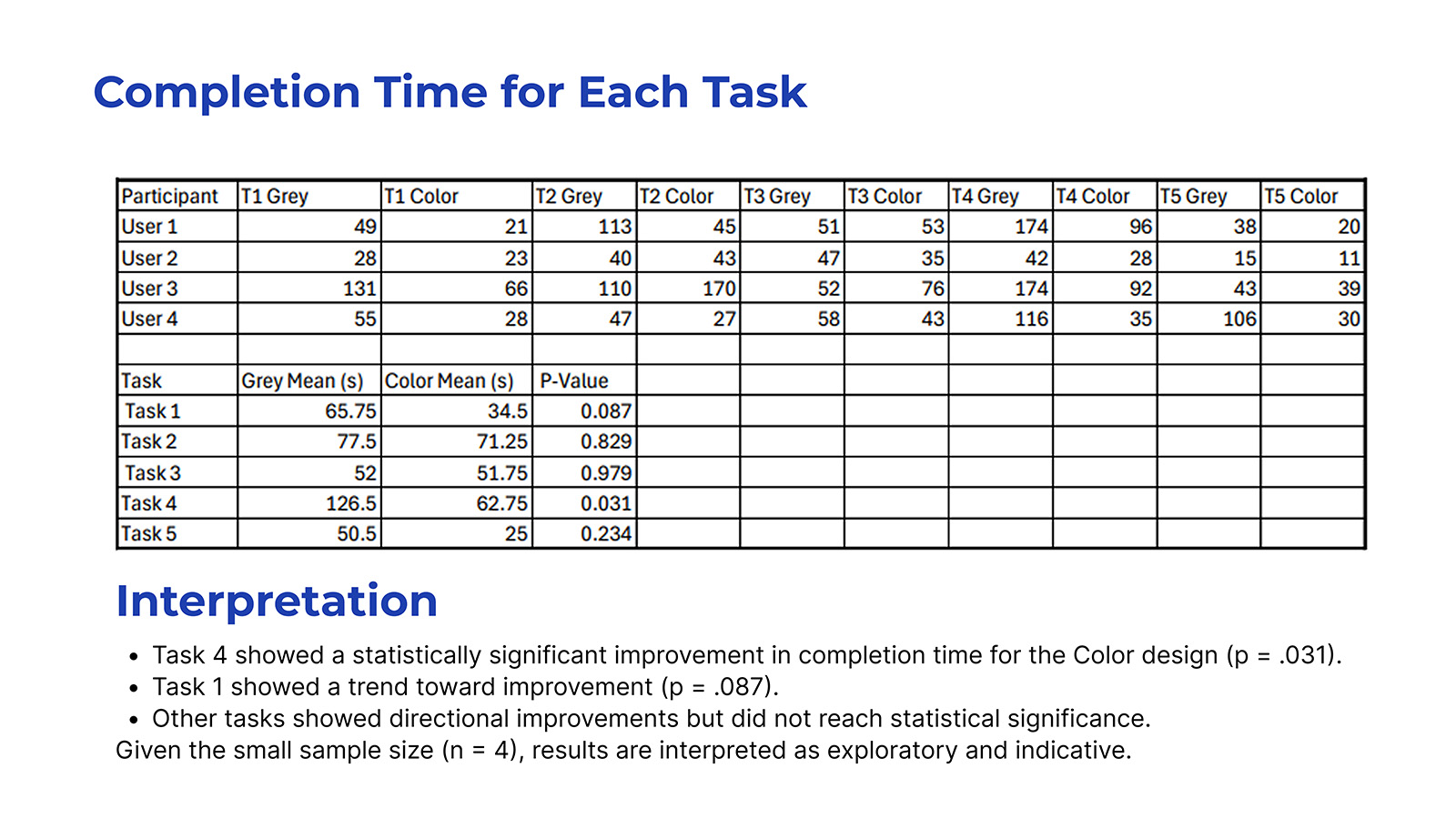
📊 Statistical Outcomes
Task 4 (Rebook) showed statistically significant improvement in Color UI. Remaining tasks showed improvement trends but did not reach significance.
The significance pattern revealed something instructive: color segmentation most powerfully aided tasks where users relied on visual pattern recognition rather than deliberate navigation, suggesting the intervention reduced cognitive overhead precisely where repetition should create automaticity.
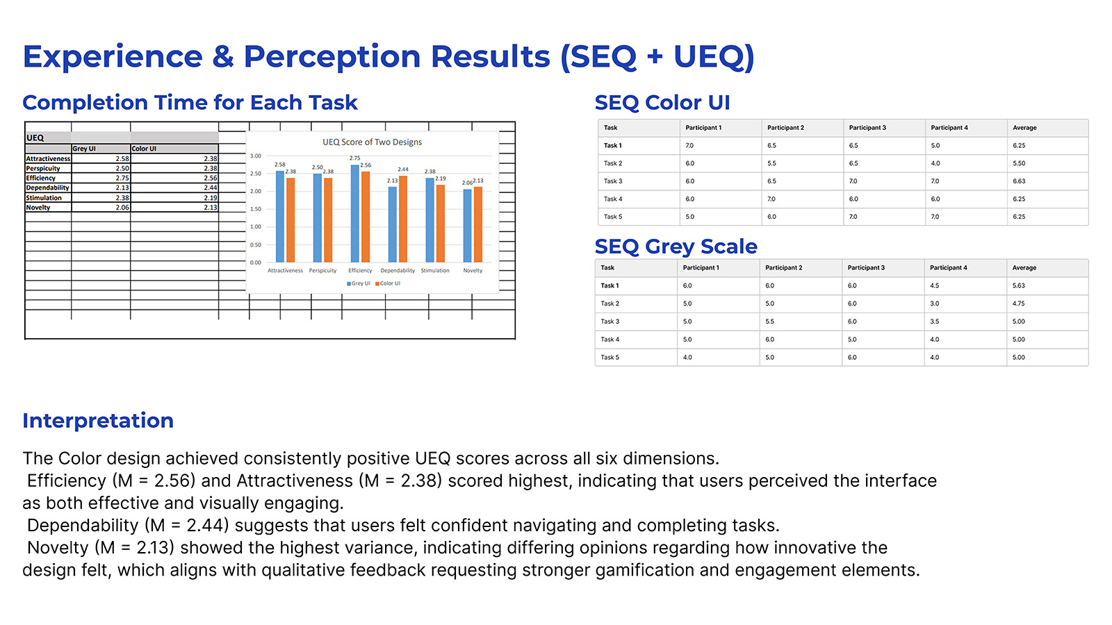
🎯 Experience & Perception Indicators (SEQ + UEQ)
Color UI Scored Higher In:
- ✓ Perceived ease of use
- ✓ Task clarity and comprehension
- ✓ Confidence navigating flows
- ✓ Mode awareness (Driver vs Host)
UEQ Strongest Gains:
- ✓ Efficiency (+directional)
- ✓ Attractiveness
- ✓ Dependability
- ⚖ Novelty (mixed—varied expectations)
These perception indicators were interpreted alongside behavioral data to triangulate meaning. The convergence of faster completion times with higher confidence ratings suggests the improvement was not merely aesthetic preference but a genuine reduction in decision-making friction, users weren't just faster, they felt more certain while being faster.
The Story: A Daily Lottery Nobody Wants to Play
"If you get a parking spot, it's like lottery."
- Participant
"As a girl, I feel safer when the lot is more full and there's more light."
- Participant
Picture a student circling a campus lot at 8:47 AM, watching the clock tick toward a 9:00 class. The permit sold out months ago. Every open space might be restricted. Every minute lost compounds into academic consequence. Event-goers face even higher stakes, forced to relocate vehicles before midnight to avoid towing, or walking 10+ minutes through sub-zero temperatures to venues they paid to attend. This isn't minor inconvenience; it's time theft, stress accumulation, and in some cases, genuine safety compromise. The lived experience of parking has become a tax on everything that parking is supposed to enable.
But the frustration isn't fundamentally about scarcity, it's about information asymmetry and the erosion of predictability. Street-level signage is ambiguous. Rules shift by day, hour, and event. Participants described feeling "in the clear" but still fearing boots and tickets. The parking experience has become an anxiety loop: uncertainty breeds caution, caution wastes time, wasted time compounds frustration, and frustration erodes the quality of whatever activity parking was meant to enable. This is the psychological architecture of the problem, and it's what ParkShare was designed to dismantle.
ParkShare's Systematic Response
The insight that shaped ParkShare was simple but systematically overlooked: cities are full of private parking supply that sits unused while drivers circle for public spots. Driveways sit empty while their owners work. Private lots go dark after business hours. ParkShare reallocates this invisible inventory into a trusted, bookable network, aligning with sustainability goals (less circling means lower CO₂), equity principles (more access to safe parking regardless of permit access), and resource optimization (activating underutilized private infrastructure near campuses and event venues). The design challenge that followed was not merely functional but cognitive: how do you build a system that transforms users' mental model of parking from "lottery" to "reservation"?
Research Methodology
Research Goals
- • Understand how drivers search for, select, and pay for parking, and what trade-offs they make under pressure
- • Surface the pain points, safety concerns, and rule confusion that existing solutions fail to address
- • Evaluate willingness to trust a peer-to-peer private driveway model, and what conditions would make it feel legitimate
- • Test core ParkShare flows with scenario-based tasks to validate structural decisions
- • Translate findings into product strategy, HMWs, and prioritized design opportunities
Participants
6 interview participants spanning students, commuters, and urban drivers across Ames, Des Moines, Chicago, and Massachusetts. Ages ranged from early 20s to mid-30s, capturing both the campus parking struggle and the urban parking tax.
4 usability test participants for mid-fidelity prototype, smartphone users comfortable with navigation and parking apps like ParkMobile, representing the target user who would adopt a new parking solution if it delivered on trust and convenience.
Methods Applied
Contextual and semi-structured interviews • Codebook development and applied coding • Thematic analysis (6 key themes) • Insight statements with impact/confidence rankings • HMW generation and opportunity–solution tree • 5 research-backed personas • Lo-Fi usability testing with SEQ ratings • Hi-Fi comparative study (within-subjects) with UEQ • Bias and rigor audit
Research Protocols
Understanding the problem was necessary but insufficient, the research needed to generate actionable design implications, not just descriptive findings. Each protocol was structured to ensure methodological consistency, reduce bias, and enable reliable comparisons across participants. The goal wasn't just to collect data, it was to create the conditions for genuine insight to emerge while maintaining the rigor that makes findings defensible and transferable to design decisions.
📝 Discovery Interview Protocol
- Duration: 20 - 25 minutes
- Format: Semi-structured, remote
- Recording: Audio w/ consent
- Structure:
- - Warm-up & context setting
- - Parking behavior exploration
- - Pain point deep-dive
- - P2P concept reaction
- - Wrap-up & debrief
The protocol ensured consistent topic coverage while allowing natural conversation flow and follow-up probing, balancing structure with space for unexpected insights that would later prove essential.
🔲 Lo-Fi Testing Protocol
- Duration: 20 - 25 minutes
- Format: Think-aloud, moderated
- Tasks: 5 scenario-based
- Metrics:
- - Task completion (Y/N)
- - SEQ per task (1 - 7)
- - Hesitation patterns
- - Label comprehension
- - Flow recoverability
This phase focused on validating whether users could form accurate mental models of the system's structure before visual treatment, testing whether the architecture was sound before investing in aesthetics that might mask fundamental navigation problems.
🎨 Hi-Fi Comparative Protocol
- Duration: 25–30 minutes
- Design: Within-subjects, counterbalanced
- Variants: Greyscale vs Color
- Data Collected:
- - Completion time (seconds)
- - SEQ difficulty (1–7)
- - UEQ experience scoring
- - Think-aloud insights
- - Variant preference rationale
Counterbalancing controlled for order effects; each participant experienced both variants, enabling direct comparison of how visual treatment affected not just performance, but the cognitive strategies users employed to navigate.
Early Sketches & Ideation
With research themes established, the next step was translating behavioral insight into interaction structure. Before committing to digital wireframes, I worked through the system using rapid paper sketches, mapping end-to-end flows, stress-testing information hierarchy, and exploring decision points where users hesitate, double-check, or lose confidence.
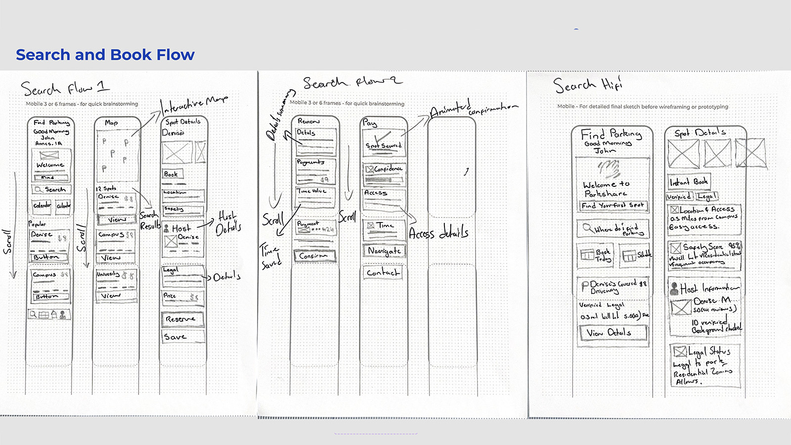
Search & Book Flow Exploration
Figure: Early sketches mapping discovery to payment, testing proximity-first scanning and trust validation.
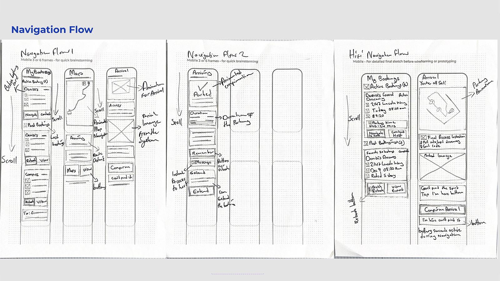
Navigation & Arrival Flow
Figure: Arrival confirmation and post-parking reassurance beyond GPS arrival.
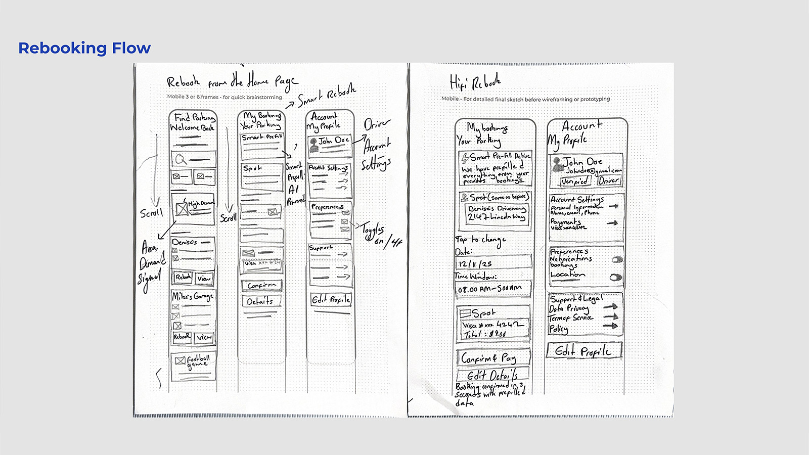
Rebooking & Smart Prefill Concepts
Figure: Recognition-based rebooking to eliminate repetitive decision-making.
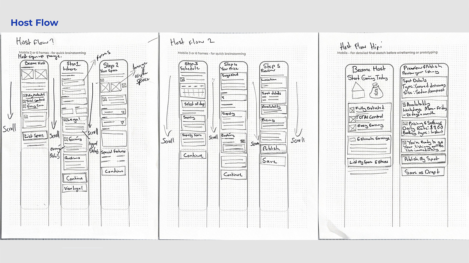
Host Onboarding & Listing Flow
Figure: Earnings-first onboarding reducing perceived risk and setup friction.
Key Findings: Six Themes from the Field
1. Reliable Spots Beat the Lottery
Drivers don't just want parking, they want predictable access to nearby spots, especially during events and peak hours. The behavioral signal: participants described arriving 1–2 hours early just to secure spaces. This represents a fundamental shift in how they allocate time, trading temporal resources for certainty because the current system offers neither. Design implication: guarantee mechanisms and confidence indicators that let users reclaim that traded time.
2. Users Pay for Proximity & Time
Drivers are pragmatic optimizers: they will pay higher rates to avoid missing events. "If it's near to that event, I'm willing to pay for it." This isn't price insensitivity, it's rational time-value calculation. Users have already internalized that time has a cost; the design's job is to make that trade-off explicit and advantageous. Design implication: frame cost as time saved, not just dollars spent, surface the value exchange.
3. Trust Rises with Safety Signals
Lighting, occupancy, neighborhood context, and host verification heavily shape perceived safety. For P2P parking to succeed, it must feel culturally "normal", not like parking in a stranger's space, but like using a vetted network. The cognitive shift required is from "unfamiliar and risky" to "verified and predictable." Design implication: safety scores, verified badges, nighttime photos that provide the evidence needed to update users' risk assessments.
4. Rule Clarity Reduces Anxiety
Ambiguous signs and event-based restrictions create constant low-grade fear of tickets, boots, or towing. Participants described feeling compliant yet still anxious. The uncertainty itself is the stressor, not just the enforcement. This is a cognitive burden that persists even when users have "done everything right." Design implication: legality overlays, towing countdown timers that externalize the ruleset and reduce the mental overhead of compliance monitoring.
5. Frictionless Flow = Value
Users avoid lots that are "more fuss than it's worth" and optimize for easy exits and no parallel parking. The cognitive load of complex parking maneuvers compounds the stress of an already frustrating search. Users aren't just avoiding difficulty, they're avoiding the mental bandwidth that difficulty consumes. Design implication: skill-based filters, fast-exit routing that let users select for simplicity.
6. Emotional Fatigue Is Real
Repeated hassles produce exhaustion that extends beyond parking into the activities parking was meant to enable. Users crave calm and assurance. "Why should this be a hassle for me?" This fatigue is cumulative, each negative parking experience depletes the emotional resources available for whatever comes next. Design implication: every interaction should reduce cognitive load, not add to it; the interface itself should feel like relief.
Research-Backed Personas
The six themes revealed what users struggled with; the next step was understanding who struggles differently. Five personas emerged from interview data to represent distinct user archetypes, behavioral patterns, and design opportunities. These aren't demographic placeholders, they're behavioral models grounded in direct quotes and observed decision patterns from discovery research. Each persona represents a distinct relationship to the core problem: scarcity, uncertainty, and the cognitive cost of navigating both. Together, they map the full decision-making landscape ParkShare must serve.
Lena
Time-Pressed Commuter
Lena's core need is minimizing time hunting while ensuring consistent access. She values reliability over savings and has high tech comfort, she'll adopt new tools if they demonstrably save her time. Her mental model treats parking as a scheduling problem, not a search problem.
Opportunity: Predictive map, "Guaranteed Spot" reservations, auto-reserve weekdays.
Caleb
Budget-Conscious Student
Caleb's core need is avoiding fees while finding safe, affordable options. He'll walk long distances and sometimes risks restricted areas when finances are tight. His constraint is money; his willingness is effort. His mental model accepts physical cost (walking) to avoid financial cost (fees).
Opportunity: Transparent pricing, legality indicators, student discounts.
Maya
Cautious Night Driver
Maya's core need is physical safety at night. She checks reviews; she avoids dimly lit or isolated areas. For her, a "good" spot isn't just close, it's well-lit, populated, and verifiably safe. Her mental model filters options through a safety lens before considering convenience.
Opportunity: Safety score, "Host Verified" badges, nighttime photos.
Ryan
Weekend Event-Goer
Ryan's core need is parking close to venues without risking towing or long post-event exits. Proximity plus fast egress and clear enforcement windows are his key criteria. He's willing to pay a premium, but only if the rules are clear. His mental model treats parking as part of the event experience, not separate from it.
Opportunity: Event-specific alerts, "Fast Exit" routing, towing timers.
Denise
Reluctant Host Homeowner
Denise's core need is earning passive income with minimal hassle while maintaining control and safety. She's interested but hesitant, she needs clear liability coverage and community legitimacy before she'll list her space. Her mental model requires trust to be established before convenience becomes relevant.
Opportunity: Host Protection dashboard, verified renter identities, earnings projections.
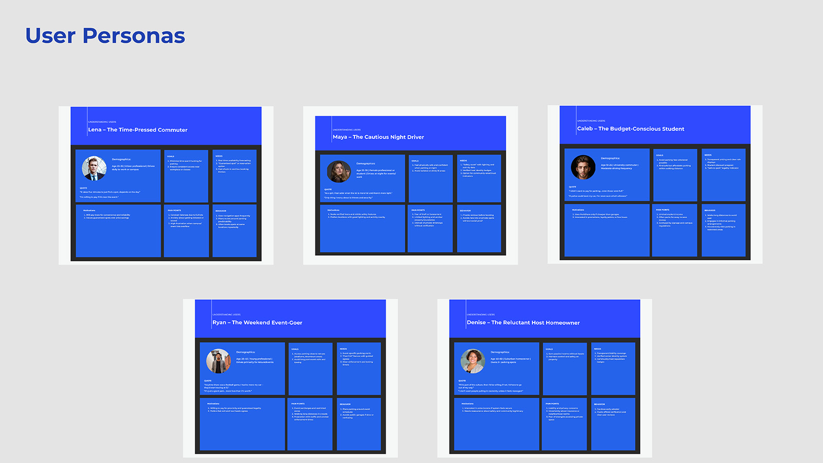
Research Persona Framework
Figure: Visual summary of five research-backed personas derived from contextual inquiry interviews. Each persona represents distinct motivations, pain points, and design opportunities identified through thematic analysis.
Empathy Maps
Personas describe who users are; empathy maps reveal how they experience the world. Empathy maps were created for each primary persona to capture the full texture of their experience: what users say, think, do, and feel about parking. These artifacts served as internalization tools for the design process, transforming abstract insights into visceral understanding of user perspectives. Most critically, they revealed the emotional architecture beneath functional behaviors: it's not enough to solve the functional problem of finding a spot; the design must also address the anxiety, frustration, and exhaustion that accumulate around that search.
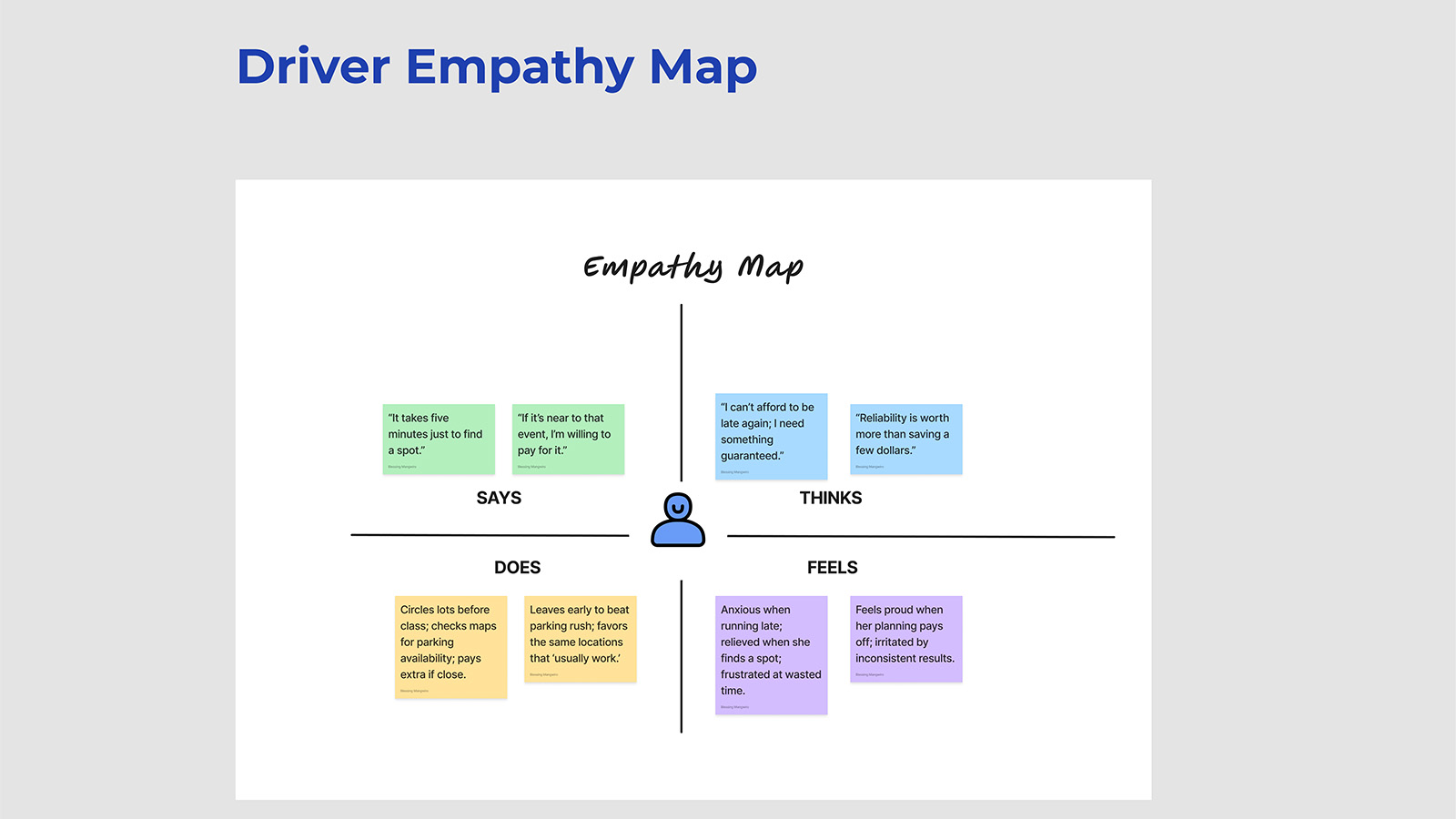
Driver Empathy Map (Lena)
Figure: Empathy map capturing the time-pressed commuter's emotional landscape, frustration with uncertainty, desire for predictability, and the relief that comes when plans work smoothly. This relief is what ParkShare must reliably deliver; it's the emotional state the design is optimizing for.
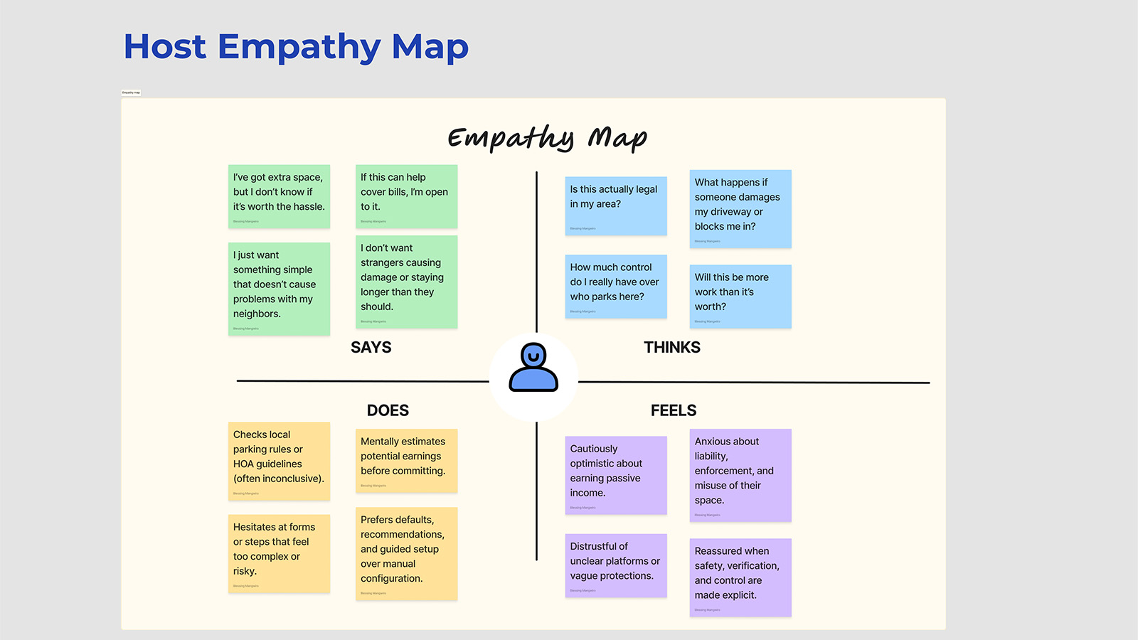
Host Empathy Map (Denise)
Figure: Empathy map for the reluctant host persona, balancing income opportunity against privacy concerns, liability fears, and neighborhood perception. Her hesitation is rational; the design must address each concern specifically, not through reassurance but through evidence and structure.
Journey Maps
Understanding user emotions at a single moment was illuminating; understanding how those emotions shift across time was essential for design. Journey maps trace the complete user experience from initial need recognition through post-parking reflection, capturing not just what users do, but how they feel at each stage. These maps revealed a critical insight: emotional highs and lows don't align neatly with functional touchpoints. Users feel most anxious during search and arrival, moments where uncertainty is highest. They feel most relieved at confirmation and departure, moments where certainty returns. ParkShare's intervention points were designed to accelerate the path to certainty and minimize the duration of anxious uncertainty.
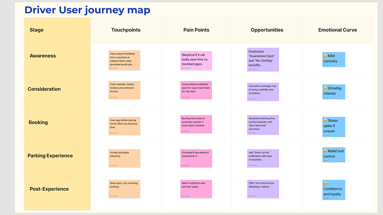
Driver Journey Map: Search → Reserve → Navigate → Park → Depart
Figure: End-to-end journey map showing emotional trajectory, touchpoints, and opportunity areas. Key insight: Anxiety peaks during search and arrival phases; confidence meter and arrival confirmation were designed specifically to intercept these moments with certainty-restoring information.
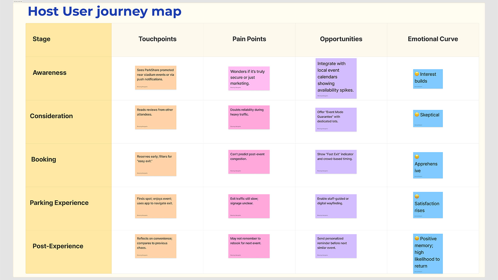
Host Journey Map: Consider → List → Manage → Earn → Expand
Figure: Host journey map tracking decision-making from initial consideration through active hosting. Trust-building moments like insurance clarity and earnings projections are critical conversion points, hesitation at these stages represents the gap between interest and action that the design must bridge.
User Flow Diagrams
Journey maps captured the emotional arc; user flows captured the structural logic. Visualizing complete user journeys for both drivers and hosts revealed friction points that weren't obvious in isolated screen designs. These flow diagrams became diagnostic tools, highlighting where users might get stuck, where information was missing, and where the experience architecture needed reinforcement. Each decision point was mapped against research findings to ensure the flow respected what users actually needed at each stage, not what seemed logical in isolation.
Driver Journey: Search → Compare → Reserve → Navigate
Figure: Core driver flow showing decision tree from search initiation through booking confirmation. Filter and sort decision points were designed based on research showing proximity and price as primary selection criteria under time pressure, the flow surfaces these attributes early to reduce cognitive search cost.
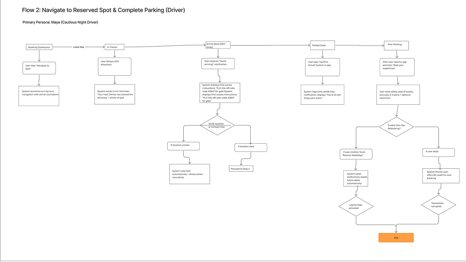
Navigating to Spot Flow
Figure: Post-booking navigation flow showing turn-by-turn integration, arrival detection, and parking confirmation steps. This flow achieved 7/7 SEQ scores, users found it immediately familiar and confidence-building, validating the decision to leverage existing mental models from maps applications.
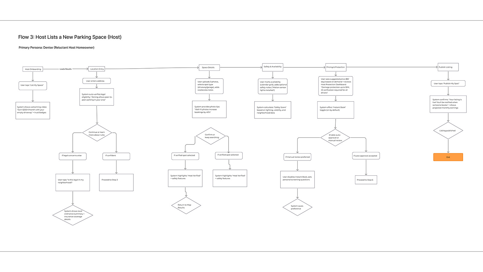
Host Journey: Onboard → List → Manage → Earn
Figure: Host listing flow showing progressive disclosure of setup steps. Earnings projection at step 4 directly addresses the key motivational driver identified in research, hosts need to see potential income before they'll commit effort, so the design front-loads that value demonstration.
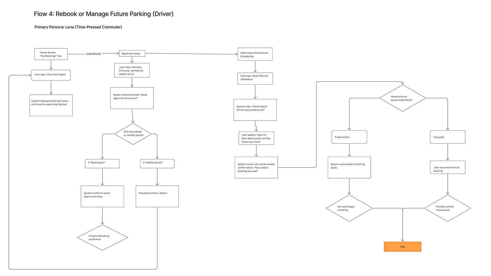
Rebook & Favorites Flow
Figure: Repeat-use flow showing favorites management and one-tap rebooking. This flow showed statistically significant improvement with color UI (p≈.031), suggesting that visual differentiation matters most when users are operating on pattern recognition rather than deliberate navigation, shifting the cognitive strategy from recall to recognition.
Concept Development + Experience Strategy
Flow 1: Find & Reserve
Because users expressed anxiety about availability uncertainty (Theme 1), the design leads with a predictive availability map featuring confidence scores, transforming "Will there be parking?" from an open question into an answerable one. Because trust concerns shaped user hesitation about P2P parking (Theme 3), results are color-coded by trust level. Spot cards show proximity, price, safety score, and legal status badges, addressing the four primary selection criteria identified in research and reducing the cognitive cost of comparison.
Flow 2: Navigate & Park
Because users described arrival anxiety, "Am I in the right place?", the design includes an arrival zone notification at ~50m with final instructions providing access details and host confirmation. The journey maps revealed arrival as an anxiety peak; this intervention intercepts that moment with certainty. The navigation flow leverages familiar maps-style patterns to minimize learning curve while adding ParkShare-specific confidence signals that address what existing navigation apps don't: "Is this definitely my spot?"
Flow 3: Host Listing
Because hosts (like Denise) prioritize income visibility over feature complexity, the flow leads with income-focused pitch ("Earn $200+/month") and culminates with projected earnings before publish. The empathy mapping revealed that hosts need to see the "why" before engaging with the "how." The structure, address → photos + spot type → safety/availability → pricing/protection → publish—reflects the progressive trust-building sequence hosts need to move from interest to commitment.
Flow 4: Rebook & Auto-Reserve
Because commuters (like Lena) described the fatigue of repeated searches (Theme 6), "My Bookings" surfaces favorites, offers one-tap "Book Again," and "Auto-Reserve Weekdays" for predictable schedules. This flow transforms parking from a daily decision into a background automation, addressing emotional fatigue by removing the need for repetitive cognitive engagement. The design bet: users who don't have to think about parking experience relief even before they park.
Value Proposition Framework
Predictability: confidence meter, guaranteed spots, addressing Theme 1 (Reliable Spots Beat the Lottery) by making availability knowable. Trust & Safety: safety scores, verified hosts, host protection dashboard, addressing Theme 3 (Trust Rises with Safety Signals) by providing the evidence users need to update their risk assessments. Legal Clarity: legality overlay, towing countdown timers, addressing Theme 4 (Rule Clarity Reduces Anxiety) by externalizing the ruleset that users otherwise carry as cognitive burden. Frictionless Flow: fast exit, skill-based filters ("no parallel parking"), one-tap rebooking, addressing Theme 5 (Frictionless Flow = Value) by letting users select for simplicity. The design frames price as time saved ("You're saving 12 minutes vs nearest garage"), addressing Theme 2 (Users Pay for Proximity & Time) by making the value exchange explicit.
Design System
The concept development defined what the interface needed to communicate; the design system defined how. A comprehensive design system was developed to ensure visual consistency, scalability, and accessibility across the ParkShare platform. But this system wasn't just about aesthetics, it encoded research insights into visual language. The color segmentation that distinguishes Driver mode (blue) from Host mode (purple) directly addresses the mode confusion observed in early testing, providing persistent contextual anchoring that reduces the cognitive question “Which mode am I in?” to a peripheral perception rather than an active inquiry. The touch-friendly 44px minimum tap targets reflect mobile-first usage patterns under stress. Every component decision traces back to what research revealed about how users actually interact with parking apps when time is short and stakes are real.
Visual Direction & Mood
Before formalizing components or tokens, a mood board was created to define the emotional and perceptual direction of ParkShare. The goal was not to follow visual trends, but to establish a calm, trustworthy, and dependable interface for a task that is inherently stressful. Parking decisions are made under time pressure; the interface needed to reduce anxiety, not amplify it.
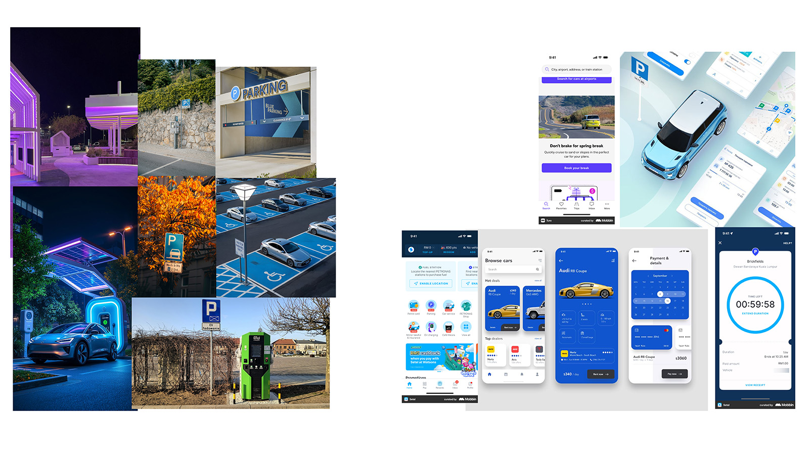
Mood Board: Trust, Control, and Calm
Figure: Visual exploration establishing ParkShare’s emotional tone. Calm blues signal reliability and certainty for drivers, while grounded purples communicate ownership and control for hosts. Restrained contrast, soft elevation, and generous spacing reinforce clarity and reduce cognitive load, supporting confident decision-making without visual noise.
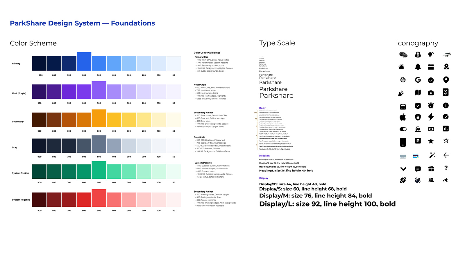
Foundations: Color, Type Scale & Iconography
Figure: ParkShare design system foundations showing role-based color palettes, type scale, and iconography. Semantic tokens and hierarchy rules ensure that mode, urgency, and system state are understood at a glance, even when users are navigating in motion.
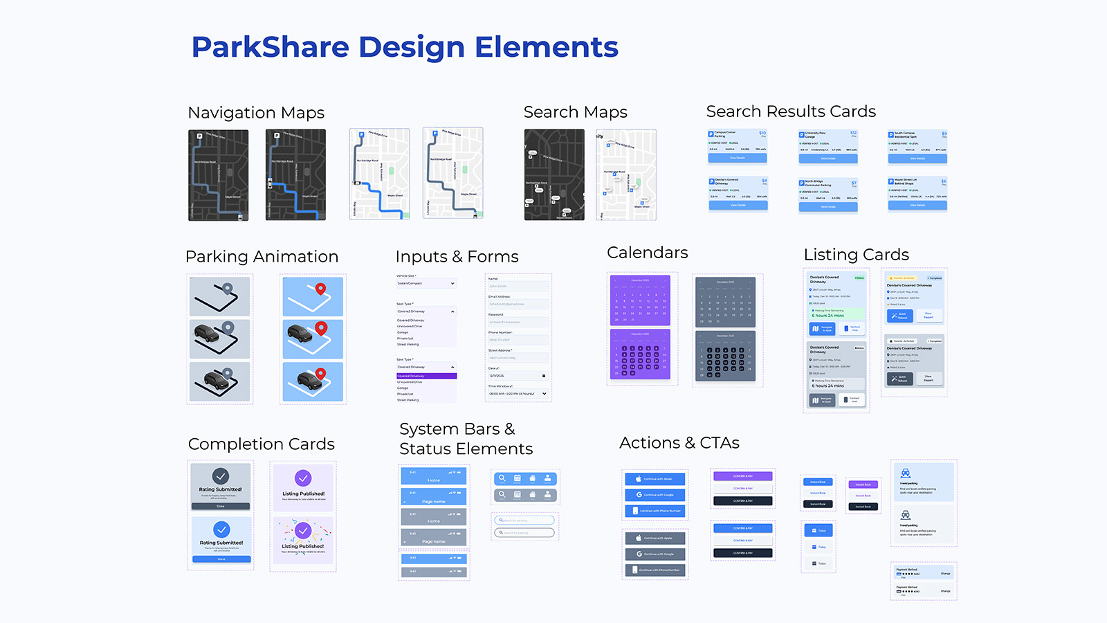
Design Elements & Interaction Patterns
Figure: Core design elements including navigation maps, search result cards, listing cards, completion states, system bars, and primary CTAs. These reusable patterns translate the design system into real product flows, supporting search, booking, hosting, and confirmation with a consistent visual and behavioral language.
Lo-Fi Prototype
With the design system established, the next phase tested whether the structural decisions held up under user interaction. The mid-fidelity prototype was built in Figma to evaluate core flows with real users before investing in visual polish. These wireframes prioritize information hierarchy, interaction patterns, and content placement, the structural decisions that determine whether users can form accurate mental models of the system. Each flow was tested with 4 participants, achieving SEQ 6.23/7 with 100% task completion. But the numbers tell only part of the story; the qualitative feedback revealed specific gaps between designer intent and user interpretation that would inform high-fidelity refinements.
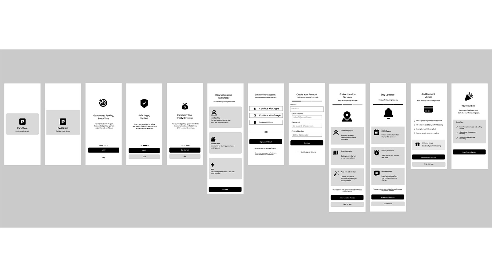
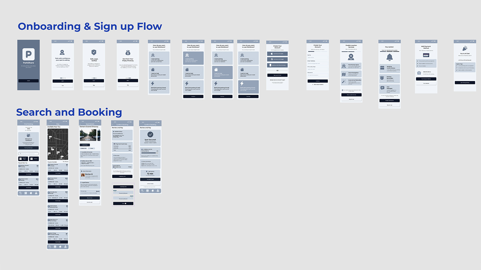
Onboarding Flow: Welcome → Account Setup → Preferences → Ready to Park
Figure: Onboarding wireframes showing progressive account setup. Testing revealed users expected immediate value preview before committing to registration, their mental model required proof of benefit before investment of effort, leading to design changes that front-load benefit demonstration.
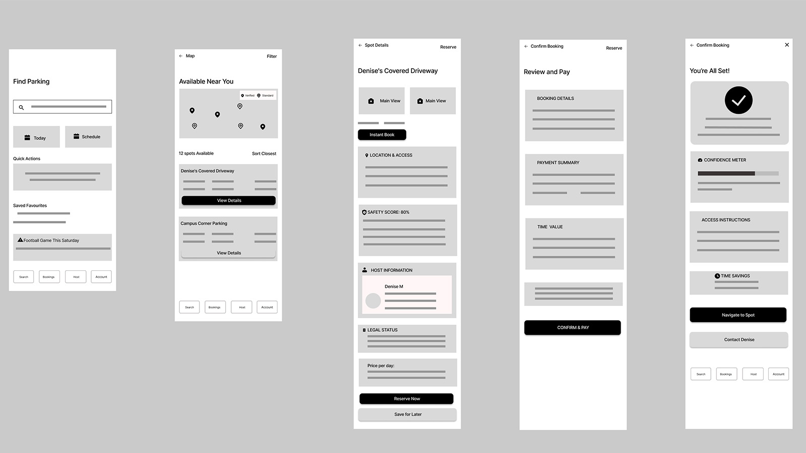
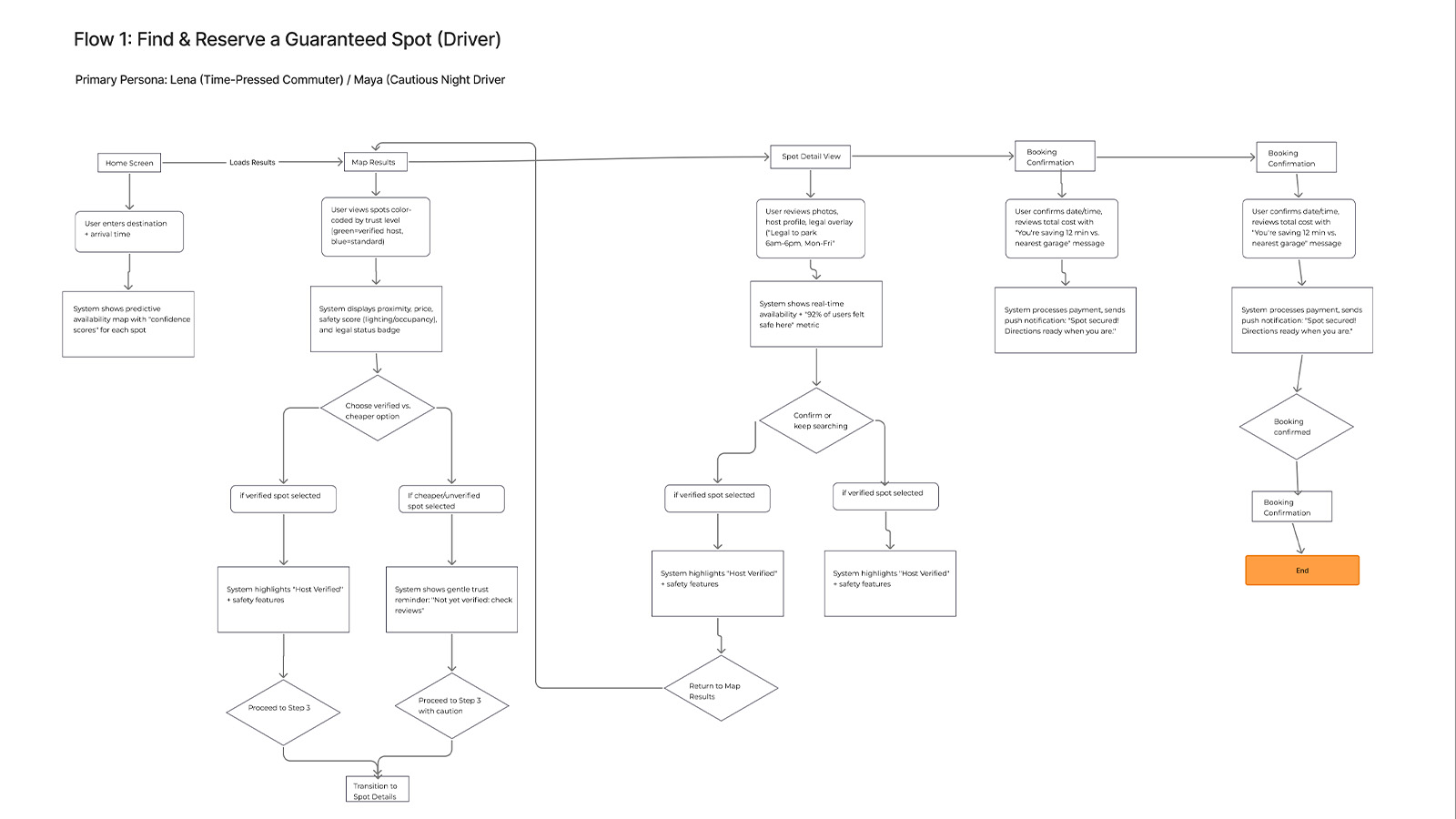
Flow 1: Find & Reserve a Guaranteed Spot (Driver Journey)
Figure: Search and booking wireframes. SEQ: 5/7. Feedback indicated need for destination entry (not just current location) and additional filter options, revealing that users' mental model of parking search is destination-centric, not location-centric: they think about where they're going, not where they are.
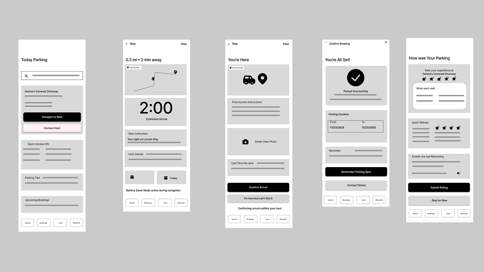
Flow 2: Navigate & Park (Directions → Arrival → Confirmation)
Figure: Navigation flow wireframes rated highest at 7/7 SEQ. Users appreciated familiar maps-style interaction patterns and clear arrival confirmation, validating the decision to leverage existing mental models rather than forcing users to learn new navigation paradigms. Transfer of learning from established apps reduced cognitive startup cost.
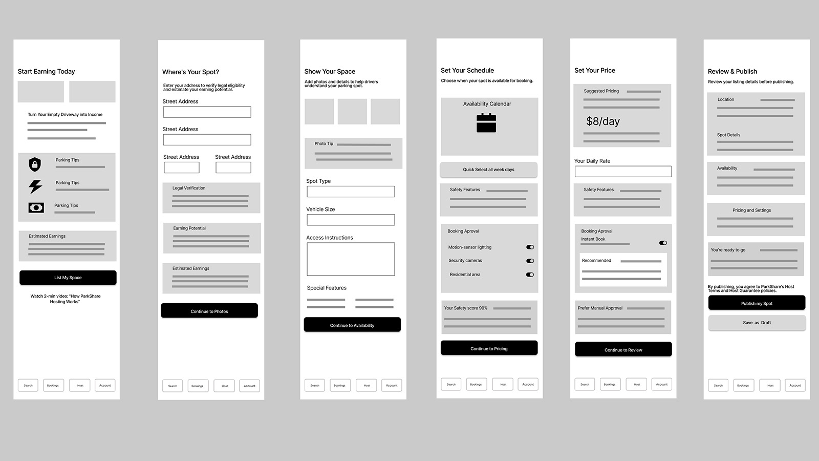
Flow 3: Host Lists a New Space (Onboard → List → Publish)
Figure: Host listing wireframes achieved 7/7 SEQ. "Clear prompts that told the user what next to do", progressive disclosure validated as the right cognitive approach for host onboarding complexity. Users didn't need to understand the whole system; they needed to know the next step clearly.

Flow 4: Rebook & Smart Scheduling (Favorites → Auto-Reserve)
Figure: Rebook wireframes scored 4/7 SEQ, lowest of all flows. Feedback: "I feel like there's a whole path that's missing." This finding directly informed Hi-Fi improvements, revealing that repeat-use flows require different structural support than first-use flows, the interface hadn't yet adapted to the experienced user's mental model.
Hi-Fi Prototype: Greyscale UI
Lo-fi testing validated the structural logic; the question that remained was how visual treatment would affect cognitive experience. The Greyscale UI variant served as the baseline condition in the comparative study, used across onboarding, search and booking, live navigation, automated rebooking, and host onboarding flows. This neutral palette isolated structural variables (information hierarchy, layout, copy) from visual treatment variables, enabling a rigorous comparison of what color actually contributes beyond aesthetics.
Onboarding, Search & Booking (Greyscale)
Figure: End-to-end greyscale flow from onboarding and sign-up into search and first booking. Without color segmentation, the experience relies entirely on layout, iconography, and copy hierarchy to guide users through trust framing, spot discovery, and booking confirmation.
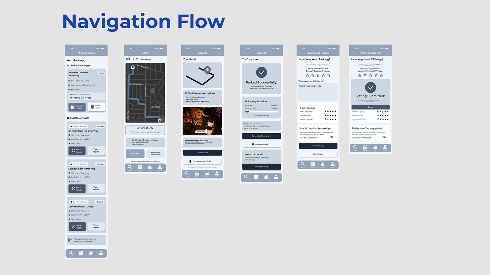
Navigation & Arrival Flow (Greyscale)
Figure: Greyscale navigation sequence from active booking to map navigation, arrival, and rating. Testing this flow in neutral tones assessed whether drivers could confidently track progress and recognize “you’re here” and “you’re done” moments without additional color-coded status cues.
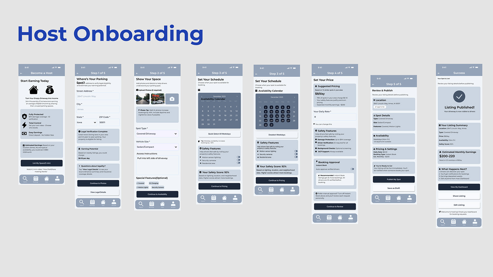
Host Onboarding & Listing Creation (Greyscale)
Figure: Greyscale host onboarding flow covering listing setup, schedule, pricing, and publish. In the baseline variant, hosts reported occasional uncertainty about whether they were in driver or host mode, evidence that, without color, mode awareness required active cognitive monitoring rather than passive perception.
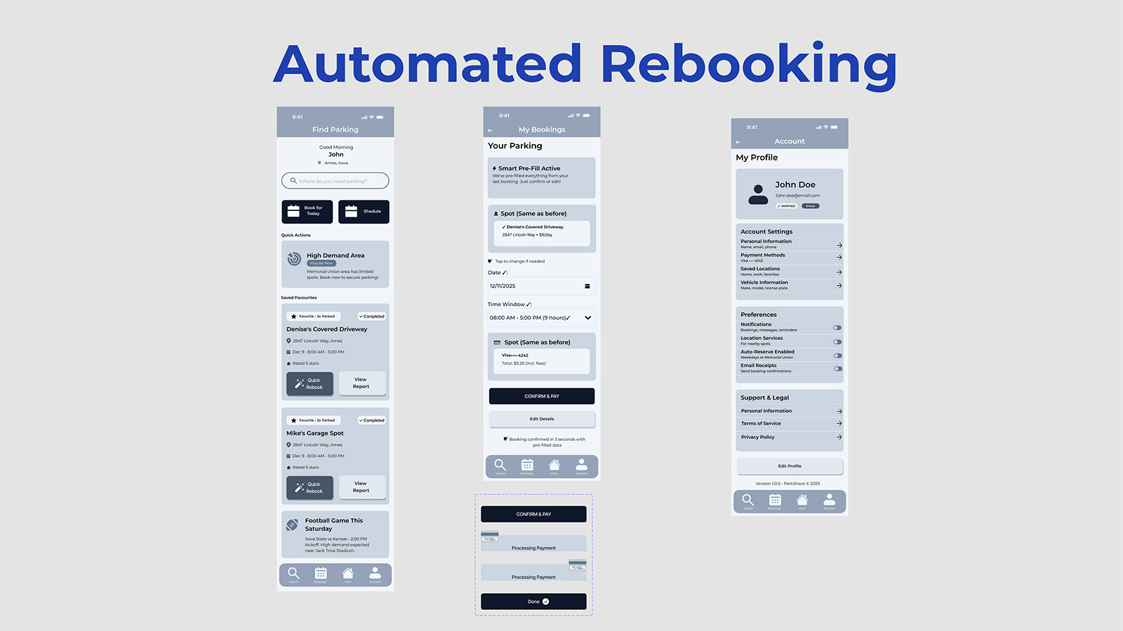
Automated Rebooking (Greyscale Baseline)
Figure: Greyscale automated rebooking and “smart pre-fill” flow. In the comparative study, Task 4 (Rebook) showed the largest performance gap, Color UI significantly outperformed greyscale, suggesting that visual differentiation most powerfully aids repeat tasks where users should operate on recognition rather than recall.
Greyscale UI Interactive Walkthrough
Video: Complete prototype walkthrough demonstrating all tested flows in the greyscale baseline condition. Participants experienced this variant in counterbalanced order during the comparative study to control for learning effects and ensure valid comparison.
Hi-Fi Prototype: Color UI (Role-Segmented)
The Color UI variant translated the same information architecture into a role-segmented visual system: blue for Driver flows, purple for Host flows, and semantic accents for status, alerts, and success. Where the greyscale prototype tested whether structure alone was sufficient, the Color UI explored how stronger perceptual cues could reduce cognitive effort. Color reinforced mode (Driver vs Host), state (active vs completed), and urgency (high-demand areas, expiring bookings), and became the experimental condition that ultimately outperformed the baseline, especially on recognition-heavy tasks like rebooking.
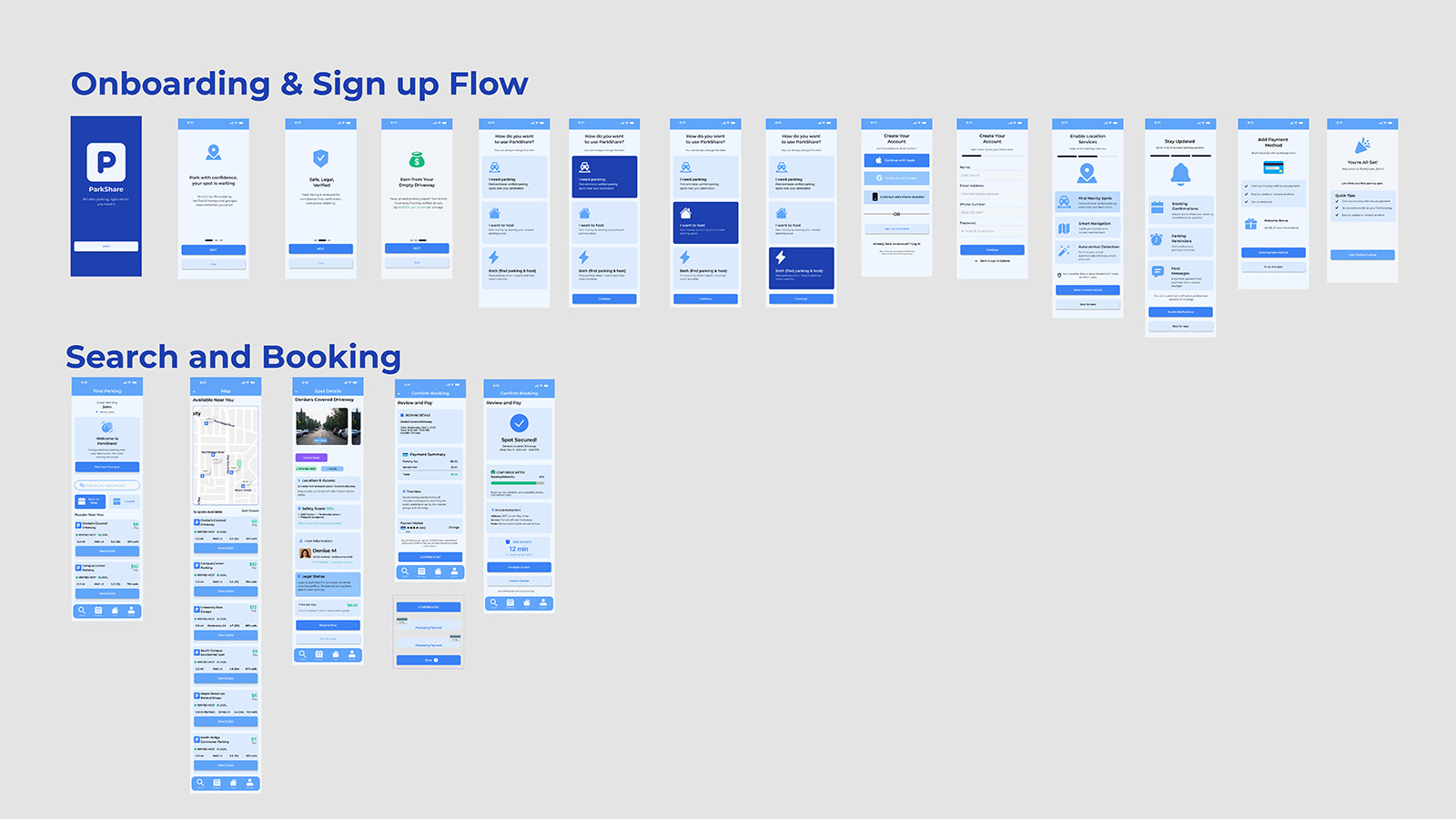
Onboarding, Search & Booking (Color)
Figure: Color UI flows for onboarding and first booking. Driver-blue surfaces frame the experience from splash screen through map-based discovery and booking, with semantic accents (high-demand yellow, success green) providing quick-read cues that help users scan options and confirm choices without rereading dense text.
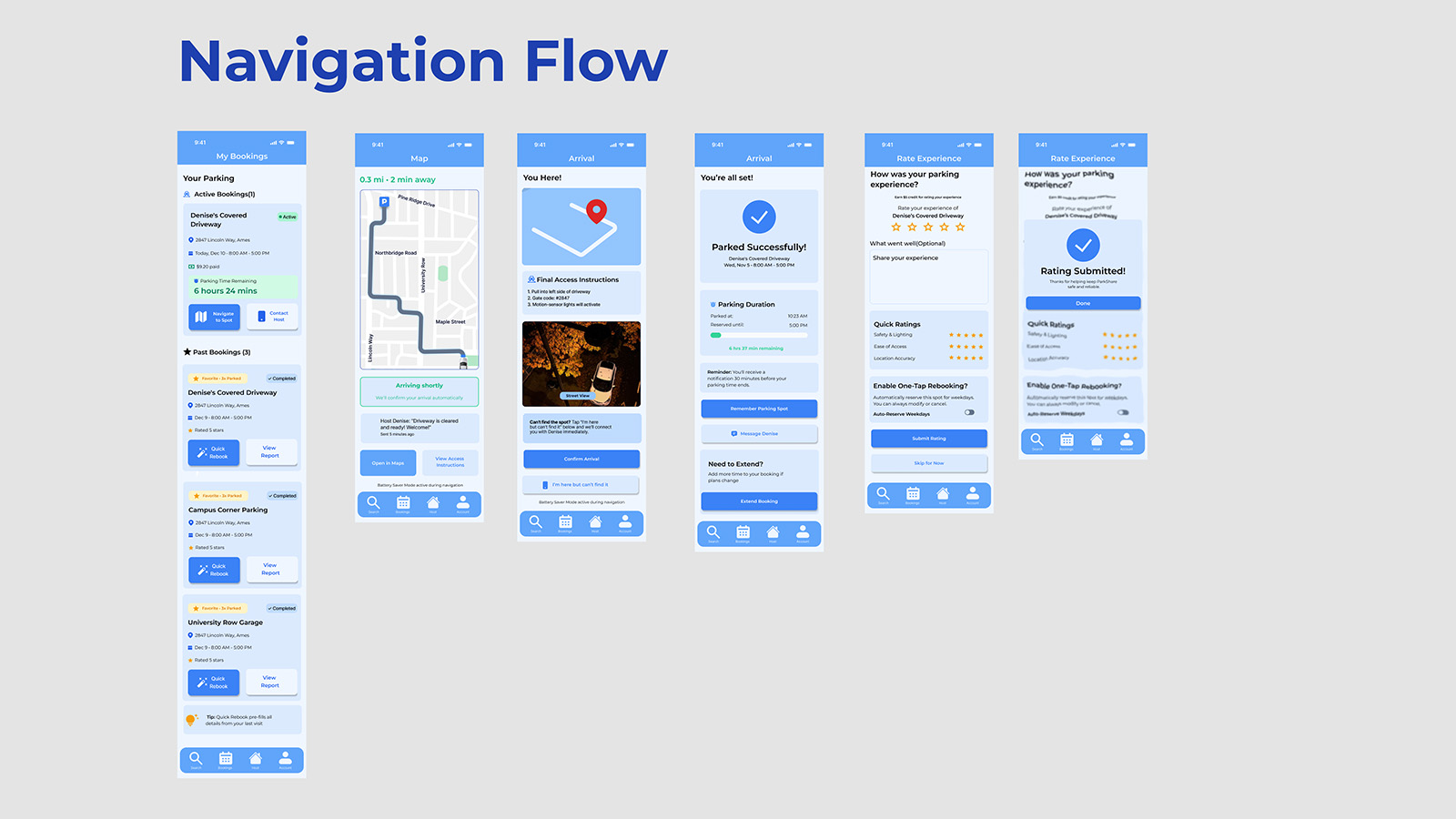
Navigation & Arrival Flow (Color)
Figure: Live navigation and arrival sequence in Color UI. Route lines, arrival states, and success banners use saturated blue and green to signal “in progress” vs “you’re parked” at a glance. Participants reported needing fewer double-checks of text labels compared to the greyscale variant.
Automated Rebooking (Color)
Figure: Color UI for automated rebooking and “smart pre-fill”. Quick actions, saved favourites, and pre-filled booking cards use color to differentiate recurring patterns from one-off actions. In testing, this task showed the largest performance gain over greyscale, supporting the insight that color most strongly benefits recognition-based repeat behaviors.
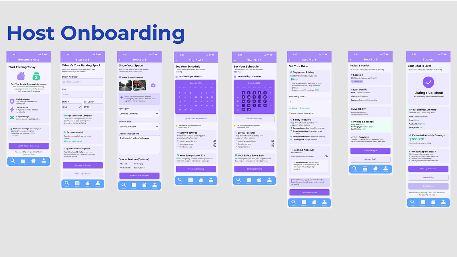
Host Onboarding & Listing Creation (Color)
Figure: Host onboarding in the purple Host mode. Consistent host coloring across steps (location, schedule, pricing, publish) eliminated mode confusion observed in the greyscale baseline. Hosts could instantly tell which “hat” they were wearing without consciously reading labels, turning mode awareness into a passive perception.
Color UI Interactive Walkthrough
Video: Complete prototype walkthrough demonstrating all tested flows in the color-segmented variant. Driver mode (blue) and Host mode (purple) differentiation persists across navigation, booking, rebooking, and hosting flows, the visual treatment that measurably improved Task 4 performance and shifted users from recall-based interaction to recognition-based decision-making.